Overview
In the Metrics section, you can see the data of your infrastructure machines and monitor its health. At the top part you can see the summary of your machines and at the bottom part, you can get details like its status, usages and etc.Details of data in metrics
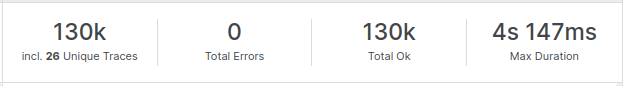
As per the selected timeframe in the chart, the following metrics will be displayed:- Total machines (including down machines)
- Total containers that each machines has
- Total services
- Total processes that are running on those machines
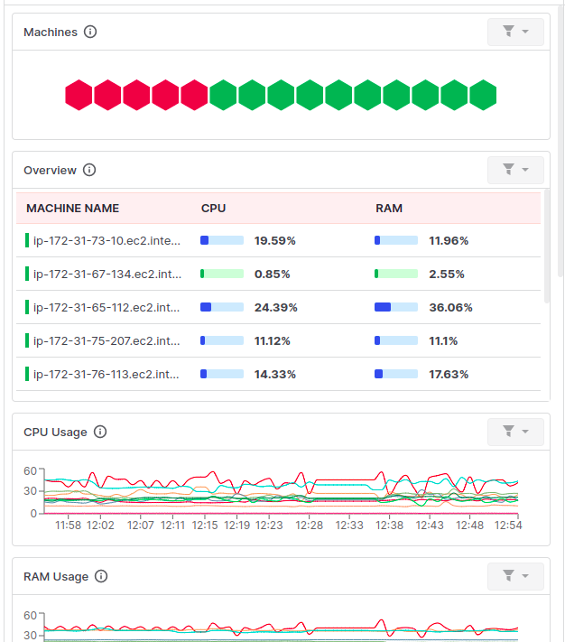
 The down one contains a few cards like graphical boxes that give you a quick comparison between hosts’ stats. These cards contain following data for a recent 1 Hour or selected interval
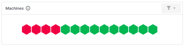
- Machines, that show available hosts in the form of a honeycomb pattern.
- Current overview of CPU & RAM stats
- CPU Usage, in form of a graphical chart
- RAM Usage, in form of a graphical chart
- Network Usage, combined chart for Receive & Transmit bandwidth
- Disk Usage, combined chart for Read & Write Speed
- Filesystem Usage, which denotes Used, Reserved & Free space
Machines
This section shows the number of machines in the cluster in a honeycomb-like pattern. The machines are grouped by their status as running or down. You can get more details about each machine by hovering over any honeycomb. You want to filter out all 3 sections of the dashboard based on any particular machine only by clicking on any machine, and that will apply a filter on the dashboard, so the rest of the cards & sections will display data accordingly. It will only show you up to 100 hexagons of recently installed machines, If you have 100+ machines installed, you can go to Infrastructure > Host-list screen to view the list of all machines.
Overview
This card will show the current CPU & RAM stats of the recently installed 25 machines in the cluster. If you want to quickly compare existing machines, such as which one consumes how much CPU and RAM, this will be useful.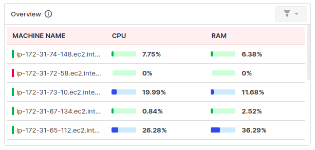
CPU usages
This is the extended version of the previous card, here you have checkpoints of every minute for the recent 1 hour or selected intervals, so by seeing ups & downs, you can measure things in wave format. This will show wave lines of recently installed 25 machines.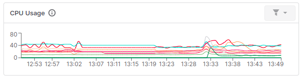
RAM Usages
Like the CPU Usage card, this also helps us to get an idea about RAM usage in a graphical form. This will also show only recently installed 25 machines.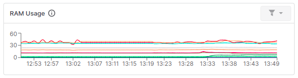
Network Usages
Network Usages displays usage based on bandwidth type. One is for Receiving bandwidth, and the other for Transmitting bandwidth. Each graph shows the bandwidth of the recently installed 25 machines. From this graph, we can compare which machines consume higher bandwidth to Receive & Transmit data packets.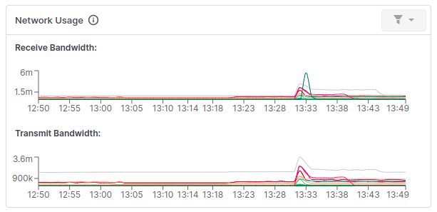
Disk Usage
Disk Usage displays Read & Write speed of any machine in the cluster.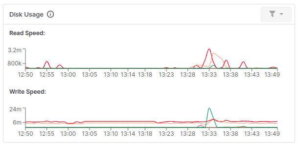
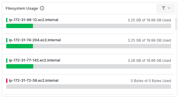
Filesystem Usage
This card shows the list of recently installed 25 machines in the form of progress bars with their Used, Reserved & Free areas, to get an idea of filesystem utilization & usage in the cluster.In the below bar, Green shows Used space, Yellow shows Reserved space, and Gray shows Free space in the cluster.
Need assistance or want to learn more about Middleware? Contact us at support[at]middleware.io.