
How Dashboards Work
The Dashboard Builder is a Graphical User Interface (GUI) based approach that enables users to create complex query logic without the added stress of learning a new query language. The metrics made available to users when constructing dashboards are dynamically generated based on the data that users ingest into Middleware. For example, if you have instrumented Middleware’s Infrastructure Agent and APM packages, you will have access to all of your host and application-level data. For more information on instrumenting the Infra Agent and APM packages, navigate to the Quickstart page.
Create New Dashboard
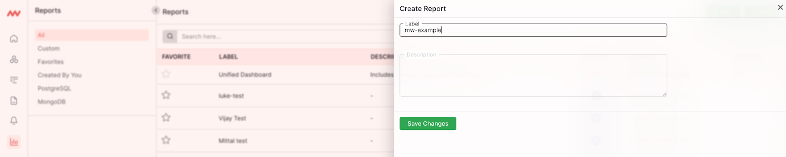
To get started, navigate to the Dashboard Builder page, select Create Dashboard, label your new dashboard and press Save Changes: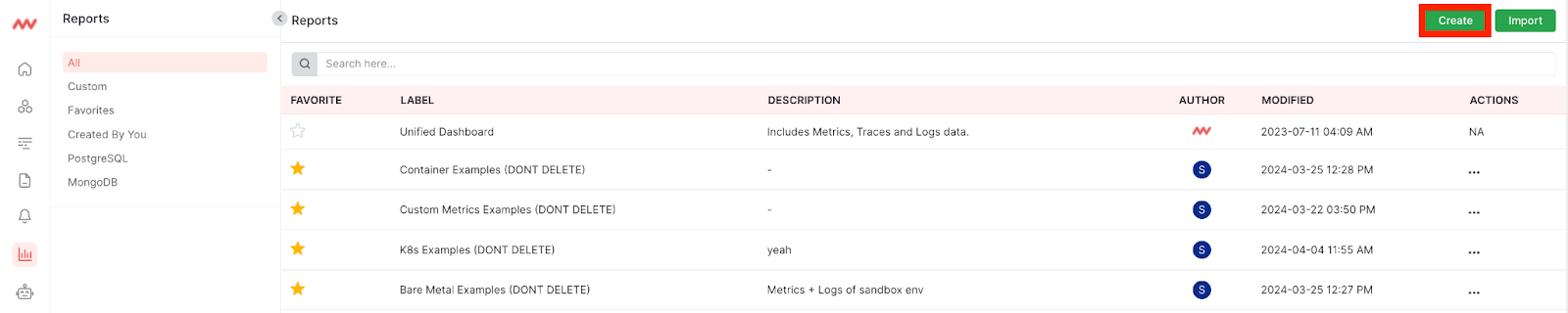
 You have the option to create a dashboard from an existing data source or create a widget for an existing dashboard. The following describes how to create a dashboard from an existing data source. For more information on creating a widget, navigate to the Create New Widget section.
Create a new dashboard by selecting a data source to start your dashboard with:
You have the option to create a dashboard from an existing data source or create a widget for an existing dashboard. The following describes how to create a dashboard from an existing data source. For more information on creating a widget, navigate to the Create New Widget section.
Create a new dashboard by selecting a data source to start your dashboard with:
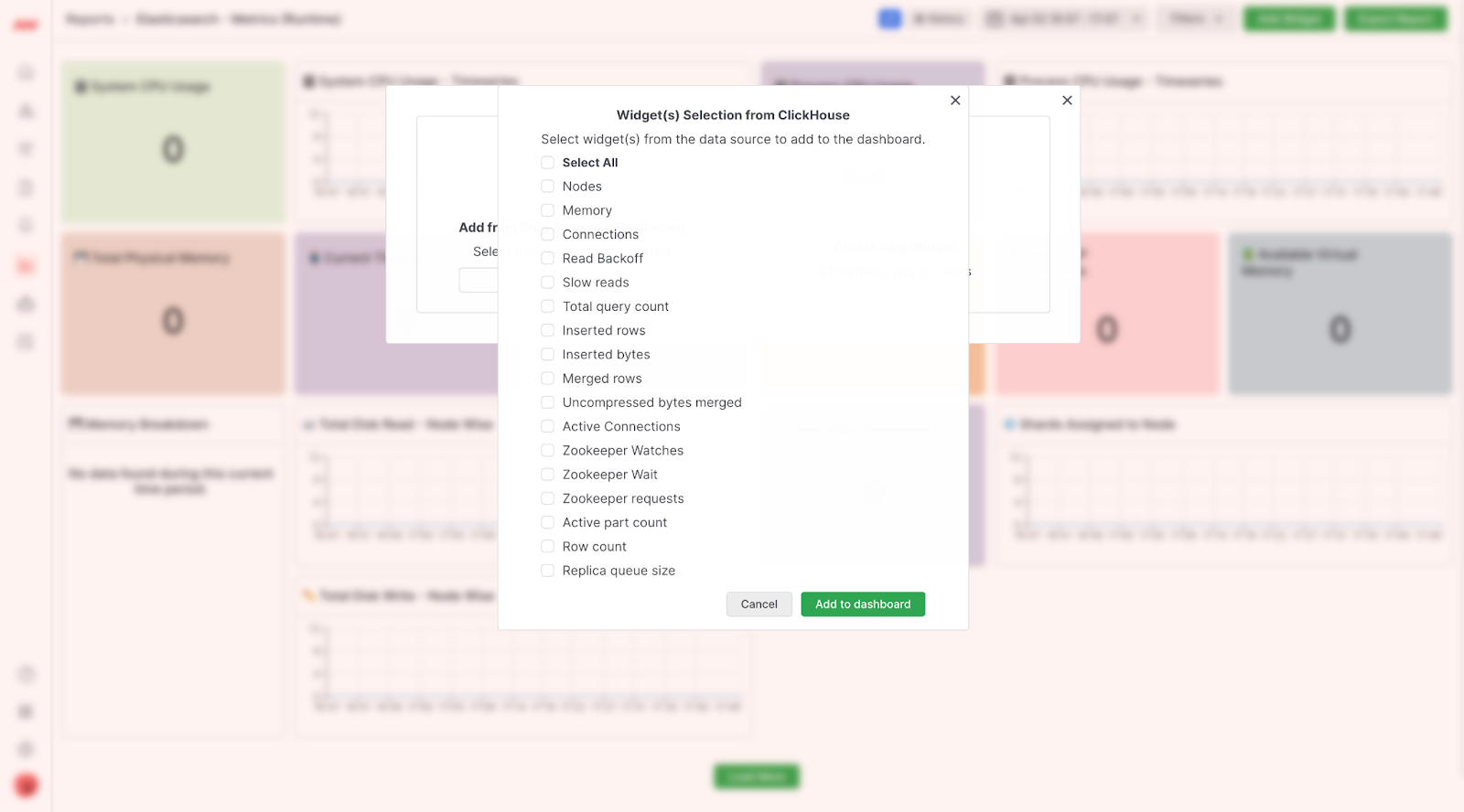
 Select the metrics you would like to include as widgets in your dashboard:
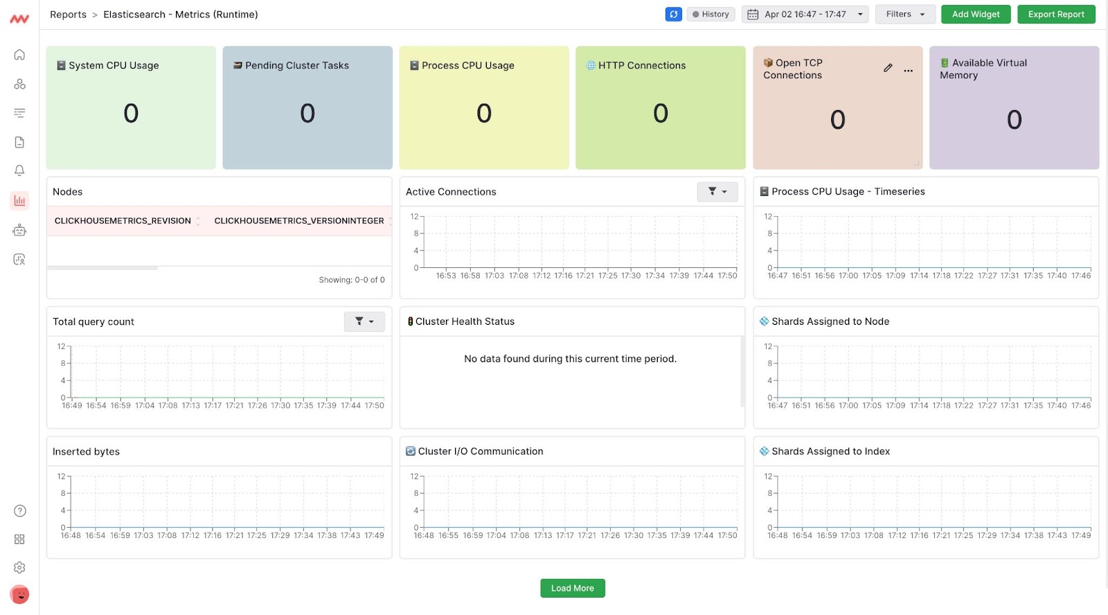
 Once you have added widgets to your dashboard, you will be taken directly to your dashboard:
Data will appear momentarily after you have created your new dashboard.
Create New Widget
Creating a new widget is useful for custom reporting and exploration. To create a new widget, navigate to the dashboard you would like to add a new widget to and select Add Widget and Create Widget: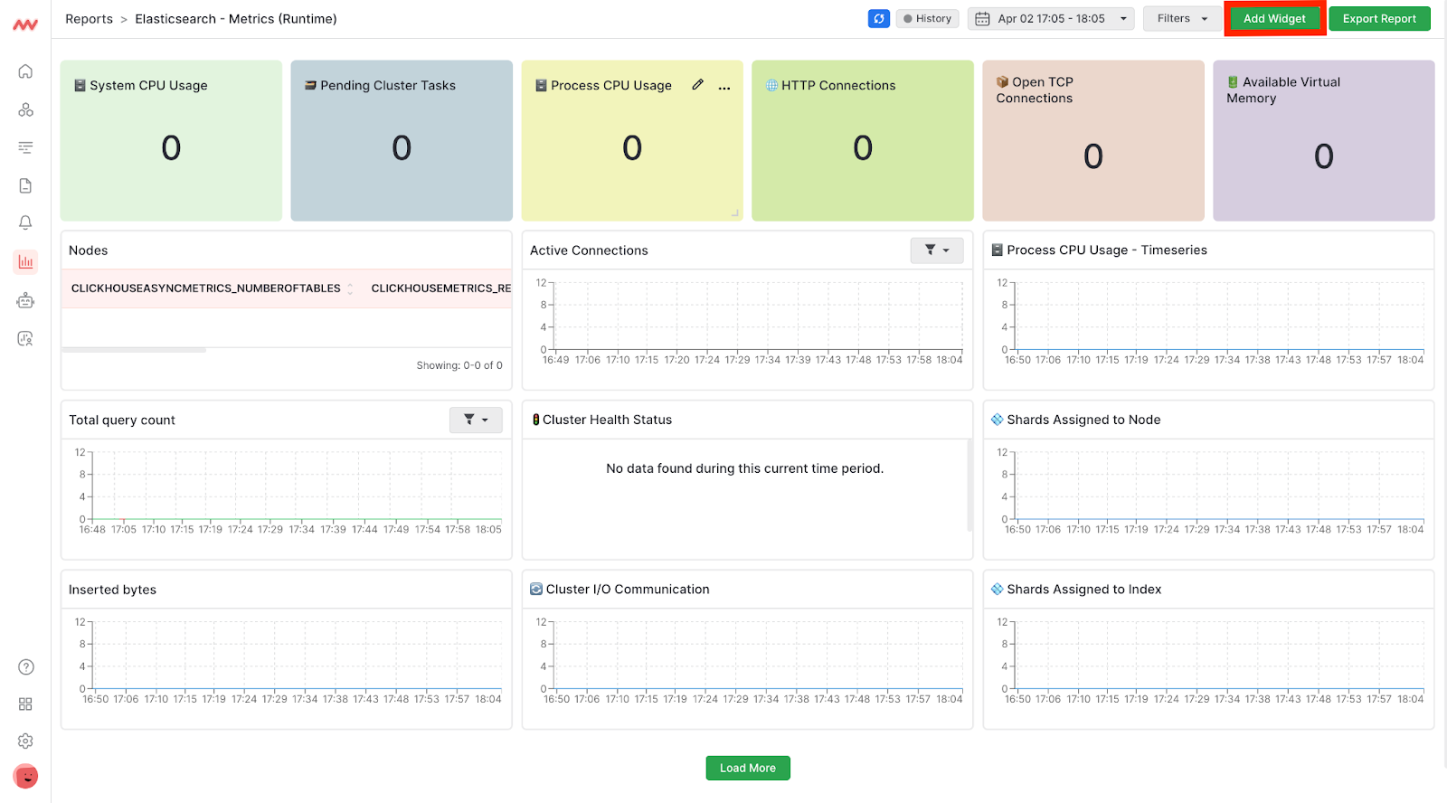
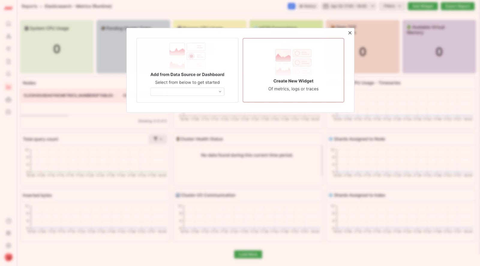
Chart Types
Choose from one of the following types of charts for your widget:
Create Your Query
Create your query logic in the Metrics Section. Select the specific metric you would like to query, aggregate, and filter. Specify the interval at which data is ingested, create metric aliases to easily interpret what is displayed within the widget, and filter out unwanted data within your query. For certain aggregation types, Average, Sum, Min and Max, there is a concept of an Aggregate By. To understand how Group By and Aggregate By work together, think of your queries like 2-dimensional arrays, where Aggregate By is a function that performs a transformation on each subarray and Group By performs an aggregate function on the aggregate outputs across all arrays.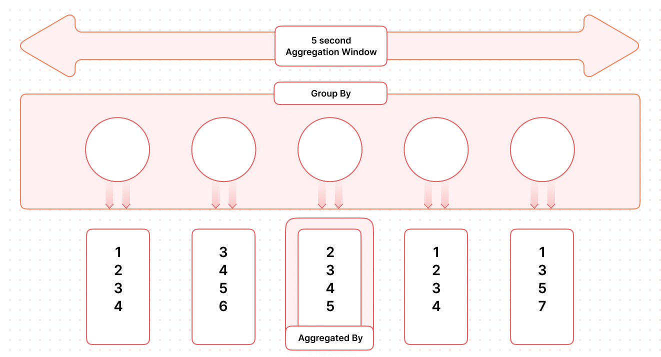
Group By
The Group By field is the outer most aggregation made in your query. Each metric is allowed to have one Group By, and each individual metric in a single widget can have different Group Bys. You can group your metrics by any resource attributes or metric attribute that Middleware has collected. The below example tracks CPU utilization by host; it is grouping thesystem.cpu.utilization metric by all unique instances of the host.name metric:
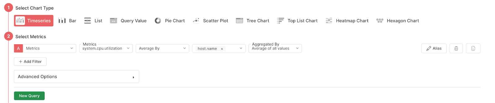 When you first create a Widget the field will be set to
 Group By. The following table displays all available options for the Group By field:
Aggregate By
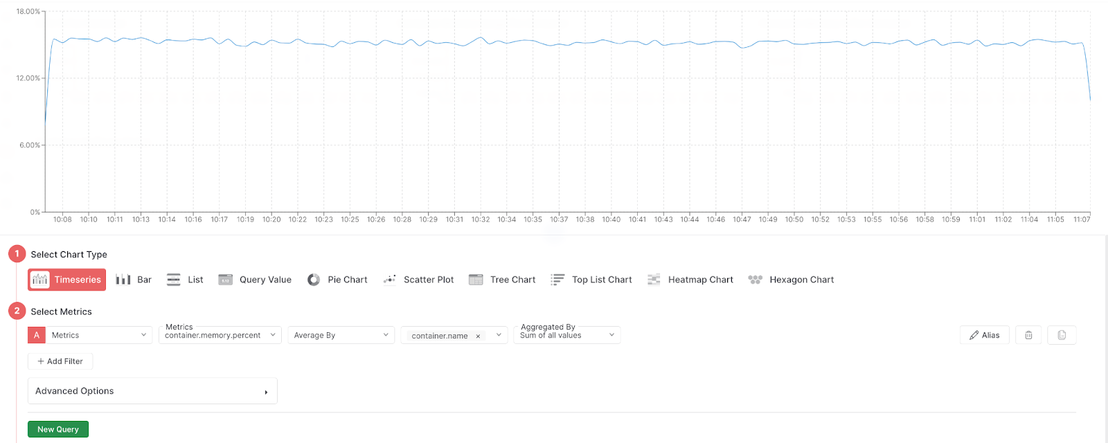
The Aggregate By field is a nested aggregation technique that allows you to aggregate your initial query, the inner layer of data. The below example is grouping thecontainer.memory.percent metric by averaging the values of the container.name attributes and summing container.memory.percent:
Filters
The filter feature is used to remove unwanted metrics within your query. The list of available filters is pulled from each metric’s attributes, and the values are based on the data pulled for that attribute in that timerange. The below example is filtering out anyhost.id containing ip-172-31-13-218.us-east-2.compute.internal:
 The following table displays all available filter functions:
Alias
The Alias feature allows you to overwrite the metric name displayed in your widget for increased readability: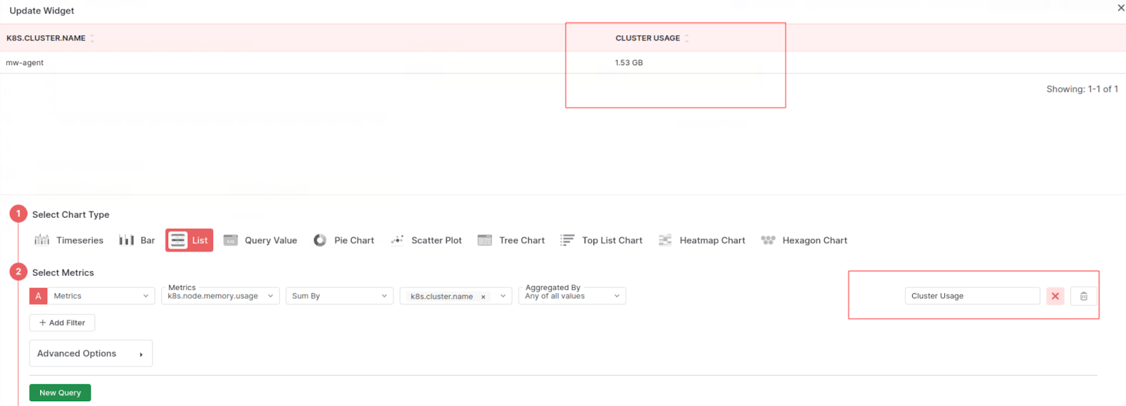
Advanced
Time Aggregation
Users are able to define the interval at which data is aggregated. By default Middleware aggregates over 15 second windows. This is most useful when sending custom metrics at a non-default rate (e.g. every 1 minute).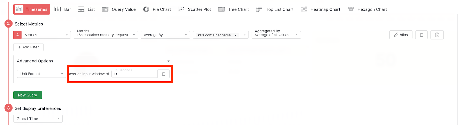
Unit Format
The Unit Format dictates how the metric is displayed on the frontend. This will impact the values you see on the y-axis as well as in the hover over tooltip. The following table displays all available Unit Formats:Display Preferences
The Display Preferences section is where more granular display options will be available. For now, the only option is to select the timerange for the widget. Global Time is the default value and tells the widget to listen to the global time range selector. Any other time range selected, e.g. 1 minute, will force the widget to ignore the global filter.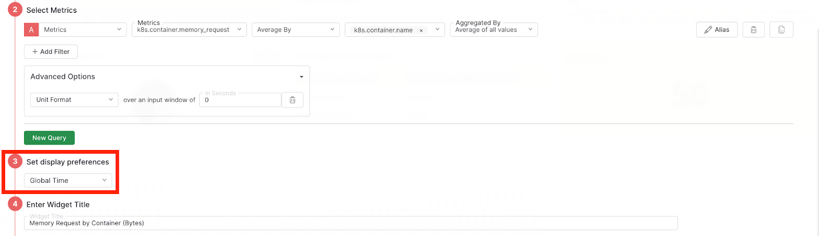
Name Your Widget
The Widget Title is the title that will be displayed at the top of your widget on the dashboard.Clone Dashboards & Widgets
The clone feature allows you to experiment with new or slightly modified dashboard designs without disrupting your existing setup. Save time by cloning widgets instead of recreating them from scratch. To clone a widget, click on the ellipses in the top right corner of the widget and selectclone:
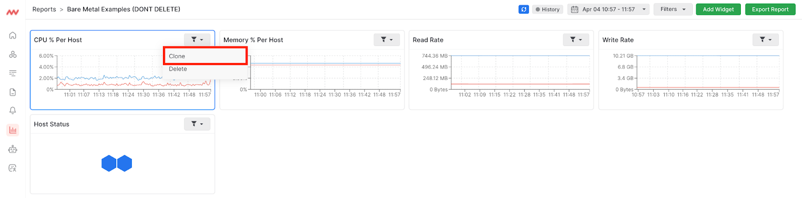 To clone a dashboard, click on the ellipses located in the dashboards table under Actions and select Clone:

Filter Dashboard Data
Live & History View
View your static dashboard data in History mode and view your real-time data in Live mode. Toggle History and Live mode on and off by clicking the button in the top right corner of your dashboard: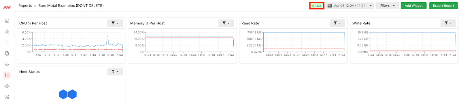
Date Range
The Date Range picker allows you to select the exact period of time to view your dashboard data. Choose predefined date ranges or select a custom range of days: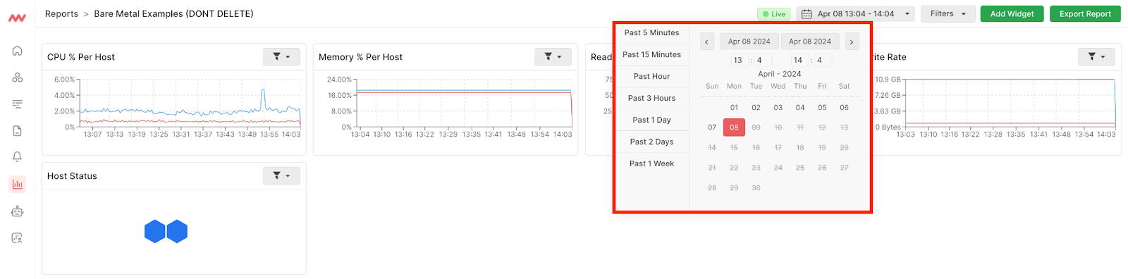
Filters
Filter metrics across your entire dashboard. The list of available filters is automatically built by the metadata pulled from all metrics being queried on the dashboard. Simply toggle on and off filters whenever you want to use them: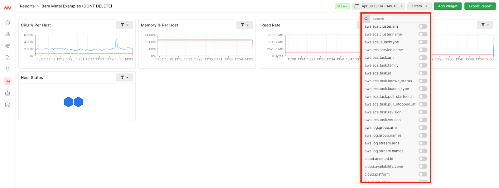
Need assistance or want to learn more about Middleware? Contact us at support[at]middleware.io.